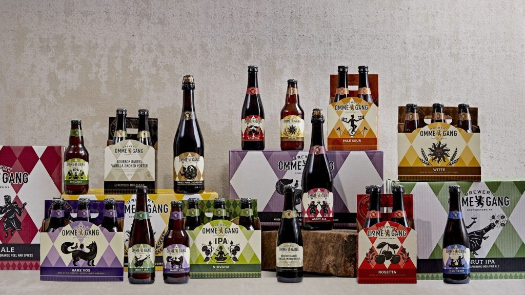
This week, Cooperstown, NY-based Brewery Ommegang announced that it is embracing a new look this year. As seen in the photo above, Ommegang has rebranded its packaging. According to a press release from Ommegang on January 24, 2019:
Longtime fans of the brewery will find much to like in the new look, including some updated illustrations from years past and more prominent use of the harlequin design. The brewery logo has also been refreshed, and a re-imagined tap handle is making its way to market.
The release also explained that regular customers will still be able to recognize their existing beer – “Ommegang’s year-round beers now enjoy rich, vibrant colors and a clean, uncluttered appearance. The brand’s well-known harlequin pattern serves as a backdrop for a series of bold silhouettes…”. Meanwhile, “packaging for limited release beers employs more subtle colors and foregoes illustrations, allowing the name alone to describe what waits within. Similarly, labels for the Blenderie Ommegang series, available only at the brewery, are simple, elegant, and restrained – reminiscent of a fine wine.”
The new labels and packaging are being shipped now, so don’t be surprised when you see them on shelves and beer taps!
Cheers!
The Brewholder
Copyright 2019 – all rights reserved
